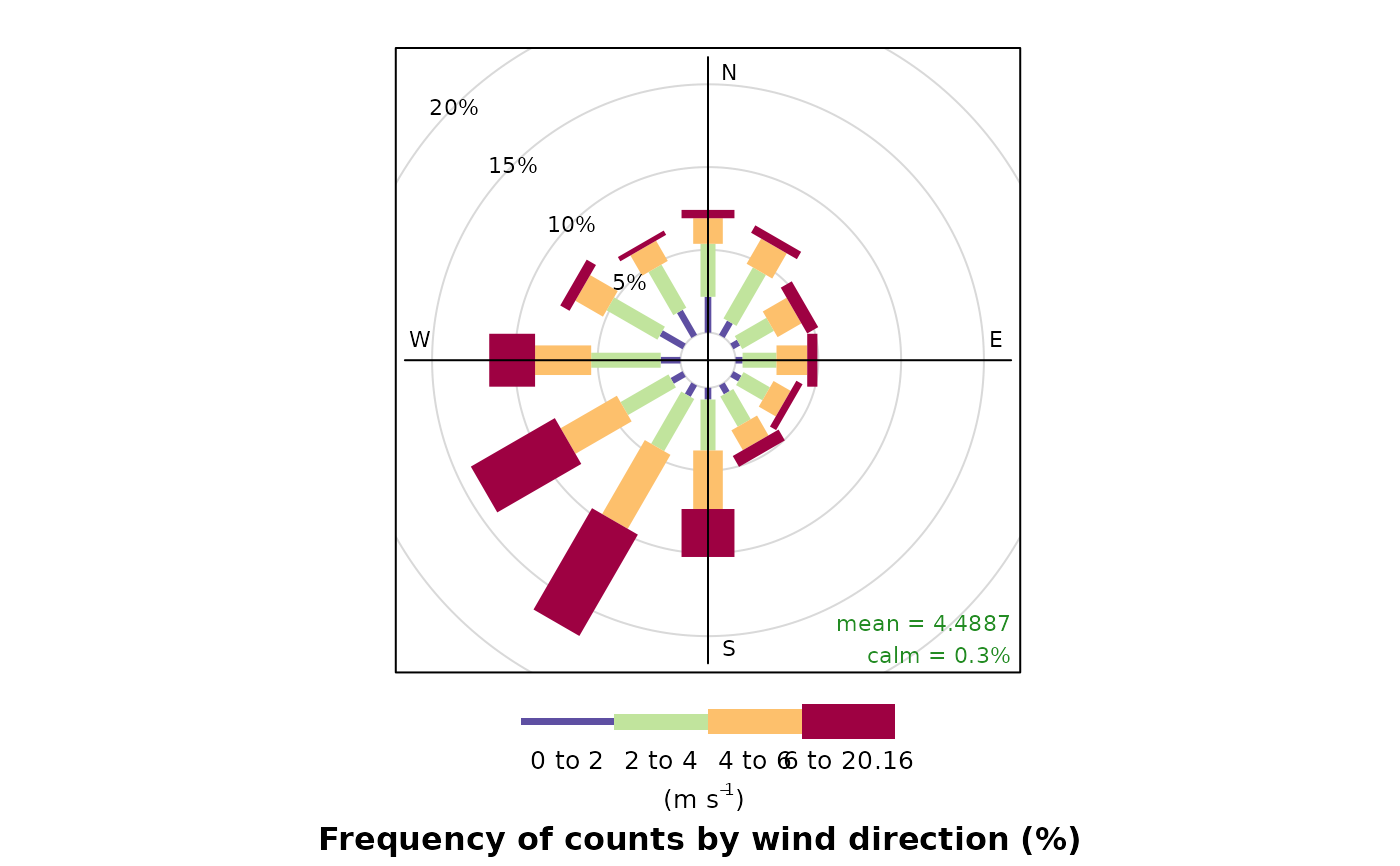
The traditional wind rose plot that plots wind speed and wind direction by different intervals. The pollution rose applies the same plot structure but substitutes other measurements, most commonly a pollutant time series, for wind speed.
Usage
windRose(
  mydata,
  ws = "ws",
  wd = "wd",
  ws2 = NA,
  wd2 = NA,
  ws.int = 2,
  angle = 30,
  type = "default",
  calm.thresh = 0,
  bias.corr = TRUE,
  cols = "default",
  grid.line = NULL,
  width = 1,
  seg = NULL,
  auto.text = TRUE,
  breaks = 4,
  offset = 10,
  normalise = FALSE,
  max.freq = NULL,
  paddle = TRUE,
  key.header = NULL,
  key.footer = "(m/s)",
  key.position = "bottom",
  key = TRUE,
  dig.lab = 5,
  include.lowest = FALSE,
  statistic = "prop.count",
  pollutant = NULL,
  annotate = TRUE,
  angle.scale = 315,
  border = NA,
  alpha = 1,
  plot = TRUE,
  ...
)
Arguments
- mydata
A data frame containing fields
wsandwd- ws
Name of the column representing wind speed.
- wd
Name of the column representing wind direction.
- ws2, wd2
The user can supply a second set of wind speed and wind direction values with which the first can be compared. See
pollutionRose()for more details.- ws.int
The Wind speed interval. Default is 2 m/s but for low met masts with low mean wind speeds a value of 1 or 0.5 m/s may be better.
- angle
Default angle of “spokes” is 30. Other potentially useful angles are 45 and 10. Note that the width of the wind speed interval may need adjusting using
width.- type
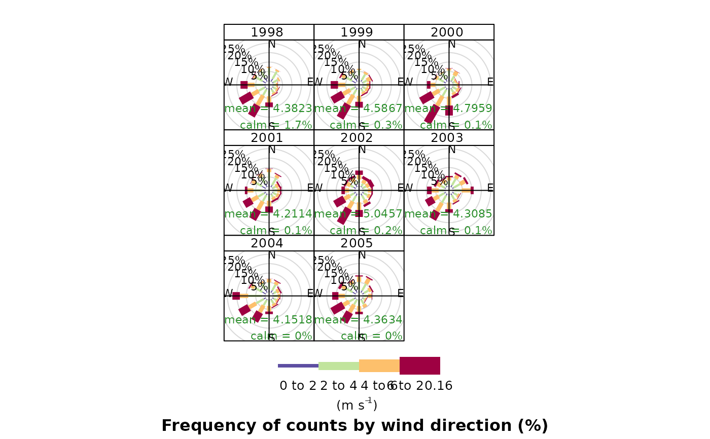
typedetermines how the data are split i.e. conditioned, and then plotted. The default is will produce a single plot using the entire data. Type can be one of the built-in types as detailed incutDatae.g. “season”, “year”, “weekday” and so on. For example,type = "season"will produce four plots — one for each season.It is also possible to choose
typeas another variable in the data frame. If that variable is numeric, then the data will be split into four quantiles (if possible) and labelled accordingly. If type is an existing character or factor variable, then those categories/levels will be used directly. This offers great flexibility for understanding the variation of different variables and how they depend on one another.Type can be up length two e.g.
type = c("season", "weekday")will produce a 2x2 plot split by season and day of the week. Note, when two types are provided the first forms the columns and the second the rows.- calm.thresh
By default, conditions are considered to be calm when the wind speed is zero. The user can set a different threshold for calms be setting
calm.threshto a higher value. For example,calm.thresh = 0.5will identify wind speeds below 0.5 as calm.- bias.corr
When
angledoes not divide exactly into 360 a bias is introduced in the frequencies when the wind direction is already supplied rounded to the nearest 10 degrees, as is often the case. For example, ifangle = 22.5, N, E, S, W will include 3 wind sectors and all other angles will be two. A bias correction can made to correct for this problem. A simple method according to Applequist (2012) is used to adjust the frequencies.- cols
Colours to be used for plotting. Options include “default”, “increment”, “heat”, “jet”, “hue” and user defined. For user defined the user can supply a list of colour names recognised by R (type
colours()to see the full list). An example would becols = c("yellow", "green", "blue", "black").- grid.line
Grid line interval to use. If
NULL, as in default, this is assigned based on the available data range. However, it can also be forced to a specific value, e.g.grid.line = 10.grid.linecan also be a list to control the interval, line type and colour. For examplegrid.line = list(value = 10, lty = 5, col = "purple").- width
For
paddle = TRUE, the adjustment factor for width of wind speed intervals. For example,width = 1.5will make the paddle width 1.5 times wider.- seg
When
paddle = TRUE,segdetermines with width of the segments. For example,seg = 0.5will produce segments 0.5 *angle.- auto.text
Either
TRUE(default) orFALSE. IfTRUEtitles and axis labels will automatically try and format pollutant names and units properly, e.g., by subscripting the ‘2’ in NO2.- breaks
Most commonly, the number of break points for wind speed. With the
ws.intdefault of 2 m/s, thebreaksdefault, 4, generates the break points 2, 4, 6, 8 m/s. However,breakscan also be used to set specific break points. For example, the argumentbreaks = c(0, 1, 10, 100)breaks the data into segments <1, 1-10, 10-100, >100.- offset
The size of the 'hole' in the middle of the plot, expressed as a percentage of the polar axis scale, default 10.
- normalise
If
TRUEeach wind direction segment is normalised to equal one. This is useful for showing how the concentrations (or other parameters) contribute to each wind sector when the proportion of time the wind is from that direction is low. A line showing the probability that the wind directions is from a particular wind sector is also shown.- max.freq
Controls the scaling used by setting the maximum value for the radial limits. This is useful to ensure several plots use the same radial limits.
- paddle
Either
TRUEorFALSE. IfTRUEplots rose using 'paddle' style spokes. IfFALSEplots rose using 'wedge' style spokes.- key.header
Adds additional text/labels above the scale key. For example, passing
windRose(mydata, key.header = "ws")adds the addition text as a scale header. Note: This argument is passed todrawOpenKey()viaquickText(), applying the auto.text argument, to handle formatting.Adds additional text/labels below the scale key. See
key.headerfor further information.- key.position
Location where the scale key is to plotted. Allowed arguments currently include “top”, “right”, “bottom” and “left”.
- key
Fine control of the scale key via
drawOpenKey().- dig.lab
The number of significant figures at which scientific number formatting is used in break point and key labelling. Default 5.
- include.lowest
Logical. If
FALSE(the default), the first interval will be left exclusive and right inclusive. IfTRUE, the first interval will be left and right inclusive. Passed to theinclude.lowestargument ofcut().- statistic
The
statisticto be applied to each data bin in the plot. Options currently include “prop.count”, “prop.mean” and “abs.count”. The default “prop.count” sizes bins according to the proportion of the frequency of measurements. Similarly, “prop.mean” sizes bins according to their relative contribution to the mean. “abs.count” provides the absolute count of measurements in each bin.- pollutant
Alternative data series to be sampled instead of wind speed. The
windRose()default NULL is equivalent topollutant = "ws". Use inpollutionRose().- annotate
If
TRUEthen the percentage calm and mean values are printed in each panel together with a description of the statistic below the plot. If" "then only the statistic is below the plot. Custom annotations may be added by setting value toc("annotation 1", "annotation 2").- angle.scale
The scale is by default shown at a 315 degree angle. Sometimes the placement of the scale may interfere with an interesting feature. The user can therefore set
angle.scaleto another value (between 0 and 360 degrees) to mitigate such problems. For exampleangle.scale = 45will draw the scale heading in a NE direction.- border
Border colour for shaded areas. Default is no border.
- alpha
The alpha transparency to use for the plotting surface (a value between 0 and 1 with zero being fully transparent and 1 fully opaque). Setting a value below 1 can be useful when plotting surfaces on a map using the package
openairmaps.- plot
Should a plot be produced?
FALSEcan be useful when analysing data to extract plot components and plotting them in other ways.- ...
Other parameters that are passed on to
drawOpenKey,lattice:xyplotandcutData. Axis and title labelling options (xlab,ylab,main) are passed toxyplotviaquickTextto handle routine formatting.
Value
an openair object. Summarised proportions can be
extracted directly using the $data operator, e.g. object$data
for output <- windRose(mydata). This returns a data frame with three
set columns: cond, conditioning based on type; wd, the
wind direction; and calm, the statistic for the proportion of
data unattributed to any specific wind direction because it was collected
under calm conditions; and then several (one for each range binned for the
plot) columns giving proportions of measurements associated with each
ws or pollutant range plotted as a discrete panel.
Details
For windRose data are summarised by direction, typically by 45 or 30
(or 10) degrees and by different wind speed categories. Typically, wind
speeds are represented by different width "paddles". The plots show the
proportion (here represented as a percentage) of time that the wind is from a
certain angle and wind speed range.
By default windRose will plot a windRose in using "paddle" style
segments and placing the scale key below the plot.
The argument pollutant uses the same plotting structure but
substitutes another data series, defined by pollutant, for wind speed.
It is recommended to use pollutionRose() for plotting pollutant
concentrations.
The option statistic = "prop.mean" provides a measure of the relative
contribution of each bin to the panel mean, and is intended for use with
pollutionRose.
Note
windRose and pollutionRose both use drawOpenKey() to
produce scale keys.
References
Applequist, S, 2012: Wind Rose Bias Correction. J. Appl. Meteor. Climatol., 51, 1305-1309.
Droppo, J.G. and B.A. Napier (2008) Wind Direction Bias in Generating Wind Roses and Conducting Sector-Based Air Dispersion Modeling, Journal of the Air & Waste Management Association, 58:7, 913-918.
See also
Other polar directional analysis functions:
percentileRose(),
polarAnnulus(),
polarCluster(),
polarDiff(),
polarFreq(),
polarPlot(),
pollutionRose()