percentileRose plots percentiles by wind direction with flexible
conditioning. The plot can display multiple percentile lines or filled areas.
Usage
percentileRose(
mydata,
pollutant = "nox",
wd = "wd",
type = "default",
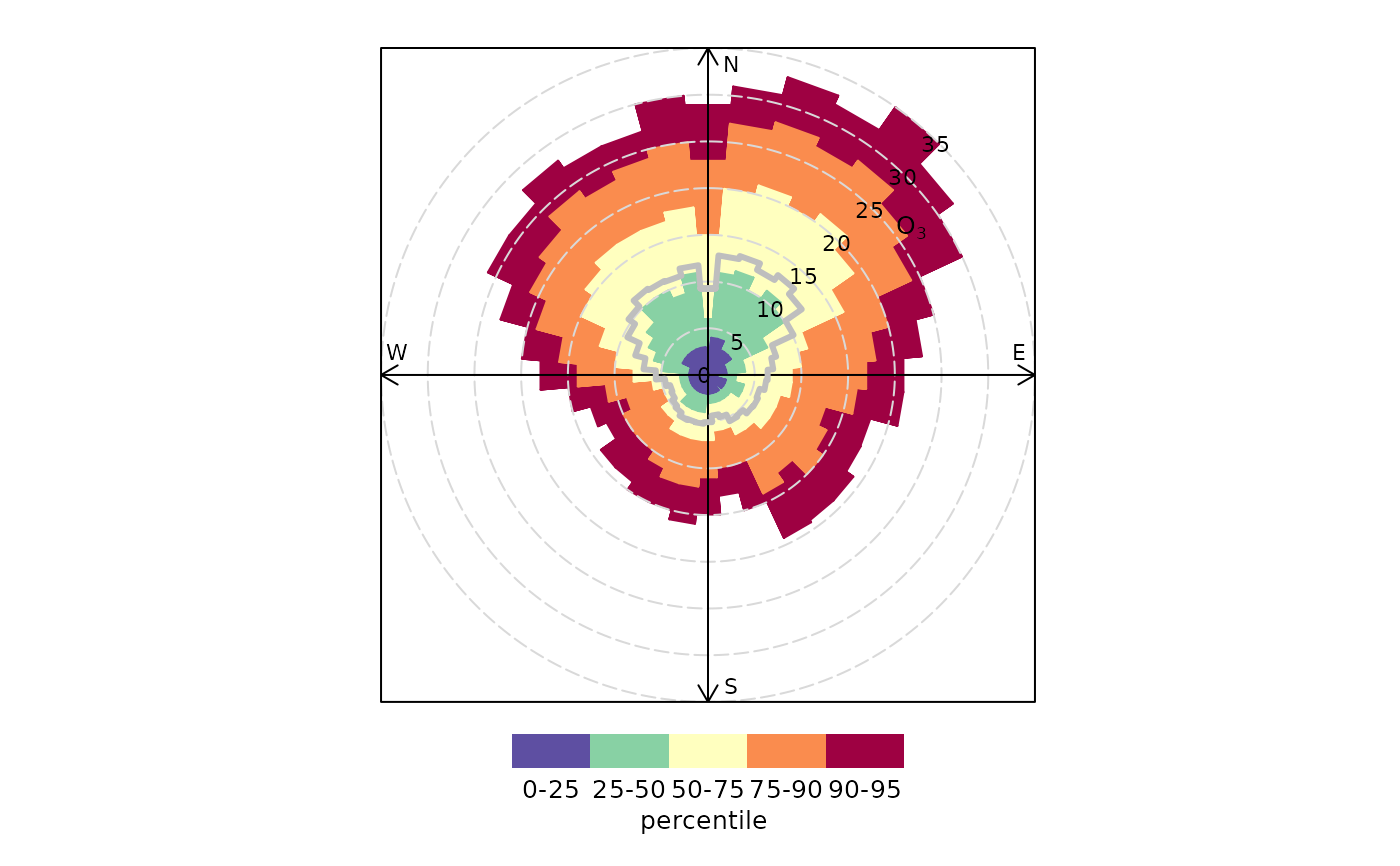
percentile = c(25, 50, 75, 90, 95),
smooth = FALSE,
method = "default",
cols = "default",
angle = 10,
mean = TRUE,
mean.lty = 1,
mean.lwd = 3,
mean.col = "grey",
fill = TRUE,
intervals = NULL,
angle.scale = 45,
auto.text = TRUE,
key.header = NULL,
key.footer = "percentile",
key.position = "bottom",
key = TRUE,
alpha = 1,
plot = TRUE,
...
)Arguments
- mydata
A data frame minimally containing
wdand a numeric field to plot —pollutant.- pollutant
Mandatory. A pollutant name corresponding to a variable in a data frame should be supplied e.g.
pollutant = "nox". More than one pollutant can be supplied e.g.pollutant = c("no2", "o3")provided there is only onetype.- wd
Name of wind direction field.
- type
typedetermines how the data are split i.e. conditioned, and then plotted. The default is will produce a single plot using the entire data. Type can be one of the built-in types as detailed incutDatae.g. “season”, “year”, “weekday” and so on. For example,type = "season"will produce four plots — one for each season.It is also possible to choose
typeas another variable in the data frame. If that variable is numeric, then the data will be split into four quantiles (if possible) and labelled accordingly. If type is an existing character or factor variable, then those categories/levels will be used directly. This offers great flexibility for understanding the variation of different variables and how they depend on one another.Type can be up length two e.g.
type = c("season", "weekday")will produce a 2x2 plot split by season and day of the week. Note, when two types are provided the first forms the columns and the second the rows.- percentile
The percentile value(s) to plot. Must be between 0–100. If
percentile = NAthen only a mean line will be shown.- smooth
Should the wind direction data be smoothed using a cyclic spline?
- method
When
method = "default"the supplied percentiles by wind direction are calculated. Whenmethod = "cpf"the conditional probability function (CPF) is plotted and a single (usually high) percentile level is supplied. The CPF is defined as CPF = my/ny, where my is the number of samples in the wind sector y with mixing ratios greater than the overall percentile concentration, and ny is the total number of samples in the same wind sector (see Ashbaugh et al., 1985).- cols
Colours to be used for plotting. Options include “default”, “increment”, “heat”, “jet” and
RColorBrewercolours — see theopenairopenColoursfunction for more details. For user defined the user can supply a list of colour names recognised by R (typecolours()to see the full list). An example would becols = c("yellow", "green", "blue").colscan also take the values"viridis","magma","inferno", or"plasma"which are the viridis colour maps ported from Python's Matplotlib library.- angle
Default angle of “spokes” is when
smooth = FALSE.- mean
Show the mean by wind direction as a line?
- mean.lty
Line type for mean line.
- mean.lwd
Line width for mean line.
- mean.col
Line colour for mean line.
- fill
Should the percentile intervals be filled (default) or should lines be drawn (
fill = FALSE).- intervals
User-supplied intervals for the scale e.g.
intervals = c(0, 10, 30, 50)- angle.scale
Sometimes the placement of the scale may interfere with an interesting feature. The user can therefore set
angle.scaleto any value between 0 and 360 degrees to mitigate such problems. For exampleangle.scale = 45will draw the scale heading in a NE direction.- auto.text
Either
TRUE(default) orFALSE. IfTRUEtitles and axis labels will automatically try and format pollutant names and units properly e.g. by subscripting the `2' in NO2.- key.header
Adds additional text/labels to the scale key. For example, passing the options
key.header = "header", key.footer = "footer1"adds addition text above and below the scale key. These arguments are passed todrawOpenKeyviaquickText, applying theauto.textargument, to handle formatting.see
key.footer.- key.position
Location where the scale key is to plotted. Allowed arguments currently include
"top","right","bottom"and"left".- key
Fine control of the scale key via
drawOpenKey. SeedrawOpenKeyfor further details.- alpha
The alpha transparency to use for the plotting surface (a value between 0 and 1 with zero being fully transparent and 1 fully opaque). Setting a value below 1 can be useful when plotting surfaces on a map using the package
openairmaps.- plot
Should a plot be produced?
FALSEcan be useful when analysing data to extract plot components and plotting them in other ways.- ...
Other graphical parameters are passed onto
cutDataandlattice:xyplot. For example,percentileRosepasses the optionhemisphere = "southern"on tocutDatato provide southern (rather than default northern) hemisphere handling oftype = "season". Similarly, common graphical arguments, such asxlimandylimfor plotting ranges andlwdfor line thickness when usingfill = FALSE, are passed onxyplot, although some local modifications may be applied by openair. For example, axis and title labelling options (such asxlab,ylabandmain) are passed toxyplotviaquickTextto handle routine formatting.
Value
an openair object
Details
percentileRose calculates percentile levels of a pollutant and plots
them by wind direction. One or more percentile levels can be calculated and
these are displayed as either filled areas or as lines.
The wind directions are rounded to the nearest 10 degrees, consistent with
surface data from the UK Met Office before a smooth is fitted. The levels by
wind direction are optionally calculated using a cyclic smooth cubic spline
using the option smooth. If smooth = FALSE then the data are
shown in 10 degree sectors.
The percentileRose function compliments other similar functions
including windRose, pollutionRose,
polarFreq or polarPlot. It is most useful for
showing the distribution of concentrations by wind direction and often can
reveal different sources e.g. those that only affect high percentile
concentrations such as a chimney stack.
Similar to other functions, flexible conditioning is available through the
type option. It is easy for example to consider multiple percentile
values for a pollutant by season, year and so on. See examples below.
percentileRose also offers great flexibility with the scale used and
the user has fine control over both the range, interval and colour.
References
Ashbaugh, L.L., Malm, W.C., Sadeh, W.Z., 1985. A residence time probability analysis of sulfur concentrations at ground canyon national park. Atmospheric Environment 19 (8), 1263-1270.
See also
Other polar directional analysis functions:
polarAnnulus(),
polarCluster(),
polarDiff(),
polarFreq(),
polarPlot(),
pollutionRose(),
windRose()
Examples
# basic percentile plot
percentileRose(mydata, pollutant = "o3")
 # 50/95th percentiles of ozone, with different colours
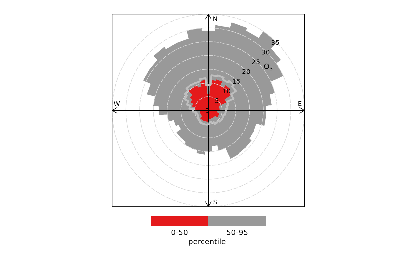
percentileRose(mydata, pollutant = "o3", percentile = c(50, 95), col = "brewer1")
# 50/95th percentiles of ozone, with different colours
percentileRose(mydata, pollutant = "o3", percentile = c(50, 95), col = "brewer1")
 if (FALSE) { # \dontrun{
# percentiles of ozone by year, with different colours
percentileRose(mydata, type = "year", pollutant = "o3", col = "brewer1")
# percentile concentrations by season and day/nighttime..
percentileRose(mydata, type = c("season", "daylight"), pollutant = "o3", col = "brewer1")
} # }
if (FALSE) { # \dontrun{
# percentiles of ozone by year, with different colours
percentileRose(mydata, type = "year", pollutant = "o3", col = "brewer1")
# percentile concentrations by season and day/nighttime..
percentileRose(mydata, type = c("season", "daylight"), pollutant = "o3", col = "brewer1")
} # }