Scatter plots with conditioning and three main approaches: conventional scatterPlot, hexagonal binning and kernel density estimates. The former also has options for fitting smooth fits and linear models with uncertainties shown.
Usage
scatterPlot(
  mydata,
  x = "nox",
  y = "no2",
  z = NA,
  method = "scatter",
  group = NA,
  avg.time = "default",
  data.thresh = 0,
  statistic = "mean",
  percentile = NA,
  type = "default",
  smooth = FALSE,
  spline = FALSE,
  linear = FALSE,
  ci = TRUE,
  mod.line = FALSE,
  cols = "hue",
  plot.type = "p",
  key = TRUE,
  key.title = group,
  key.columns = 1,
  key.position = "right",
  strip = TRUE,
  log.x = FALSE,
  log.y = FALSE,
  x.inc = NULL,
  y.inc = NULL,
  limits = NULL,
  windflow = NULL,
  y.relation = "same",
  x.relation = "same",
  ref.x = NULL,
  ref.y = NULL,
  k = NA,
  dist = 0.02,
  map = FALSE,
  auto.text = TRUE,
  plot = TRUE,
  ...
)
Arguments
- mydata
A data frame containing at least two numeric variables to plot.
- x
Name of the x-variable to plot. Note that x can be a date field or a factor. For example,
xcan be one of theopenairbuilt in types such as"year"or"season".- y
Name of the numeric y-variable to plot.
- z
Name of the numeric z-variable to plot for
method = "scatter"ormethod = "level". Note that formethod = "scatter"points will be coloured according to a continuous colour scale, whereas formethod = "level"the surface is coloured.- method
Methods include “scatter” (conventional scatter plot), “hexbin” (hexagonal binning using the
hexbinpackage). “level” for a binned or smooth surface plot and “density” (2D kernel density estimates).- group
The grouping variable to use, if any. Setting this to a variable in the data frame has the effect of plotting several series in the same panel using different symbols/colours etc. If set to a variable that is a character or factor, those categories or factor levels will be used directly. If set to a numeric variable, it will split that variable in to quantiles.
- avg.time
This defines the time period to average to. Can be “sec”, “min”, “hour”, “day”, “DSTday”, “week”, “month”, “quarter” or “year”. For much increased flexibility a number can precede these options followed by a space. For example, a timeAverage of 2 months would be
period = "2
  month"
. See functiontimeAveragefor further details on this. This option se useful as one method by which the number of points plotted is reduced i.e. by choosing a longer averaging time.- data.thresh
The data capture threshold to use (\ the data using
avg.time. A value of zero means that all available data will be used in a particular period regardless if of the number of values available. Conversely, a value of 100 will mean that all data will need to be present for the average to be calculated, else it is recorded asNA. Not used ifavg.time = "default".- statistic
The statistic to apply when aggregating the data; default is the mean. Can be one of "mean", "max", "min", "median", "frequency", "sd", "percentile". Note that "sd" is the standard deviation and "frequency" is the number (frequency) of valid records in the period. "percentile" is the percentile level (\ "percentile" option - see below. Not used if
avg.time = "default".- percentile
The percentile level in percent used when
statistic =
  "percentile"
and when aggregating the data withavg.time. The default is 95. Not used ifavg.time = "default".- type
typedetermines how the data are split i.e. conditioned, and then plotted. The default is will produce a single plot using the entire data. Type can be one of the built-in types as detailed incutDatae.g. “season”, “year”, “weekday” and so on. For example,type = "season"will produce four plots — one for each season.It is also possible to choose
typeas another variable in the data frame. If that variable is numeric, then the data will be split into four quantiles (if possible) and labelled accordingly. If type is an existing character or factor variable, then those categories/levels will be used directly. This offers great flexibility for understanding the variation of different variables and how they depend on one another.Type can be up length two e.g.
type = c("season", "weekday")will produce a 2x2 plot split by season and day of the week. Note, when two types are provided the first forms the columns and the second the rows.- smooth
A smooth line is fitted to the data if
TRUE; optionally with 95 percent confidence intervals shown. Formethod = "level"a smooth surface will be fitted to binned data.- spline
A smooth spline is fitted to the data if
TRUE. This is particularly useful when there are fewer data points or when a connection line between a sequence of points is required.- linear
A linear model is fitted to the data if
TRUE; optionally with 95 percent confidence intervals shown. The equation of the line and R2 value is also shown.- ci
Should the confidence intervals for the smooth/linear fit be shown?
- mod.line
If
TRUEthree lines are added to the scatter plot to help inform model evaluation. The 1:1 line is solid and the 1:0.5 and 1:2 lines are dashed. Together these lines help show how close a group of points are to a 1:1 relationship and also show the points that are within a factor of two (FAC2).mod.lineis appropriately transformed when x or y axes are on a log scale.- cols
Colours to be used for plotting. Options include “default”, “increment”, “heat”, “jet” and
RColorBrewercolours — see theopenairopenColoursfunction for more details. For user defined the user can supply a list of colour names recognised by R (typecolours()to see the full list). An example would becols = c("yellow", "green", "blue")- plot.type
latticeplot type. Can be “p” (points — default), “l” (lines) or “b” (lines and points).- key
Should a key be drawn? The default is
TRUE.- key.title
The title of the key (if used).
- key.columns
Number of columns to be used in the key. With many pollutants a single column can make to key too wide. The user can thus choose to use several columns by setting
columnsto be less than the number of pollutants.- key.position
Location where the scale key is to plotted. Allowed arguments currently include “top”, “right”, “bottom” and “left”.
- strip
Should a strip be drawn? The default is
TRUE.- log.x
Should the x-axis appear on a log scale? The default is
FALSE. IfTRUEa well-formatted log10 scale is used. This can be useful for checking linearity once logged.- log.y
Should the y-axis appear on a log scale? The default is
FALSE. IfTRUEa well-formatted log10 scale is used. This can be useful for checking linearity once logged.- x.inc
The x-interval to be used for binning data when
method = "level".- y.inc
The y-interval to be used for binning data when
method = "level".- limits
For
method = "level"the function does its best to choose sensible limits automatically. However, there are circumstances when the user will wish to set different ones. The limits are set in the formc(lower, upper), solimits = c(0, 100)would force the plot limits to span 0-100.- windflow
This option allows a scatter plot to show the wind speed/direction shows as an arrow. The option is a list e.g.
windflow
  = list(col = "grey", lwd = 2, scale = 0.1)
. This option requires wind speed (ws) and wind direction (wd) to be available.The maximum length of the arrow plotted is a fraction of the plot dimension with the longest arrow being
scaleof the plot x-y dimension. Note, if the plot size is adjusted manually by the user it should be re-plotted to ensure the correct wind angle. The list may contain other options topanel.arrowsin thelatticepackage. Other useful options includelength, which controls the length of the arrow head andangle, which controls the angle of the arrow head.This option works best where there are not too many data to ensure over-plotting does not become a problem.
- y.relation
This determines how the y-axis scale is plotted. “same” ensures all panels use the same scale and “free” will use panel-specific scales. The latter is a useful setting when plotting data with very different values.
- x.relation
This determines how the x-axis scale is plotted. “same” ensures all panels use the same scale and “free” will use panel-specific scales. The latter is a useful setting when plotting data with very different values.
- ref.x
See
ref.yfor details.- ref.y
A list with details of the horizontal lines to be added representing reference line(s). For example,
ref.y = list(h = 50, lty
  = 5)
will add a dashed horizontal line at 50. Several lines can be plotted e.g.ref.y = list(h = c(50, 100), lty = c(1, 5), col = c("green", "blue")). Seepanel.ablinein thelatticepackage for more details on adding/controlling lines.- k
Smoothing parameter supplied to
gamfor fitting a smooth surface whenmethod = "level".- dist
When plotting smooth surfaces (
method = "level"andsmooth = TRUE,distcontrols how far from the original data the predictions should be made. Seeexclude.too.farfrom themgcvpackage. Data are first transformed to a unit square. Values should be between 0 and 1.- map
Should a base map be drawn? This option is under development.
- auto.text
Either
TRUE(default) orFALSE. IfTRUEtitles and axis labels will automatically try and format pollutant names and units properly e.g. by subscripting the ‘2’ in NO2.- plot
Should a plot be produced?
FALSEcan be useful when analysing data to extract plot components and plotting them in other ways.- ...
Other graphical parameters are passed onto
cutDataand an appropriatelatticeplot function (xyplot,levelplotorhexbinplotdepending onmethod). For example,scatterPlotpasses the optionhemisphere = "southern"on tocutDatato provide southern (rather than default northern) hemisphere handling oftype = "season". Similarly, for the default casemethod = "scatter"common axis and title labelling options (such asxlab,ylab,main) are passed toxyplotviaquickTextto handle routine formatting. Other common graphical parameters, e.g.layoutfor panel arrangement,pchfor plot symbol andlwdandltyfor line width and type, as also available (see examples below).For
method = "hexbin"it can be useful to transform the scale if it is dominated by a few very high values. This is possible by supplying two functions: one that that applies the transformation and the other that inverses it. For log scaling (the default) for example,trans = function(x) log(x)andinv = function(x) exp(x). For a square root transform usetrans = sqrtandinv = function(x) x^2. To not carry out any transformation the optionstrans = NULLandinv = NULLshould be used.
Value
an openair object
Details
scatterPlot() is the basic function for plotting scatter plots in flexible
ways in openair. It is flexible enough to consider lots of
conditioning variables and takes care of fitting smooth or linear
relationships to the data.
There are four main ways of plotting the relationship between two variables,
which are set using the method option. The default "scatter"
will plot a conventional scatterPlot. In cases where there are lots of data
and over-plotting becomes a problem, then method = "hexbin" or
method = "density" can be useful. The former requires the
hexbin package to be installed.
There is also a method = "level" which will bin the x and
y data according to the intervals set for x.inc and
y.inc and colour the bins according to levels of a third variable,
z. Sometimes however, a far better understanding of the relationship
between three variables (x, y and z) is gained by
fitting a smooth surface through the data. See examples below.
A smooth fit is shown if smooth = TRUE which can help show the overall
form of the data e.g. whether the relationship appears to be linear or not.
Also, a linear fit can be shown using linear = TRUE as an option.
The user has fine control over the choice of colours and symbol type used.
Another way of reducing the number of points used in the plots which can
sometimes be useful is to aggregate the data. For example, hourly data can be
aggregated to daily data. See timePlot() for examples here.
By default plots are shown with a colour key at the bottom and in the case of
conditioning, strips on the top of each plot. Sometimes this may be overkill
and the user can opt to remove the key and/or the strip by setting key
and/or strip to FALSE. One reason to do this is to maximise the
plotting area and therefore the information shown.
See also
linearRelation, timePlot and
timeAverage() for details on selecting averaging times and other
statistics in a flexible way
Examples
# load openair data if not loaded already
dat2004 <- selectByDate(mydata, year = 2004)

# basic use, single pollutant

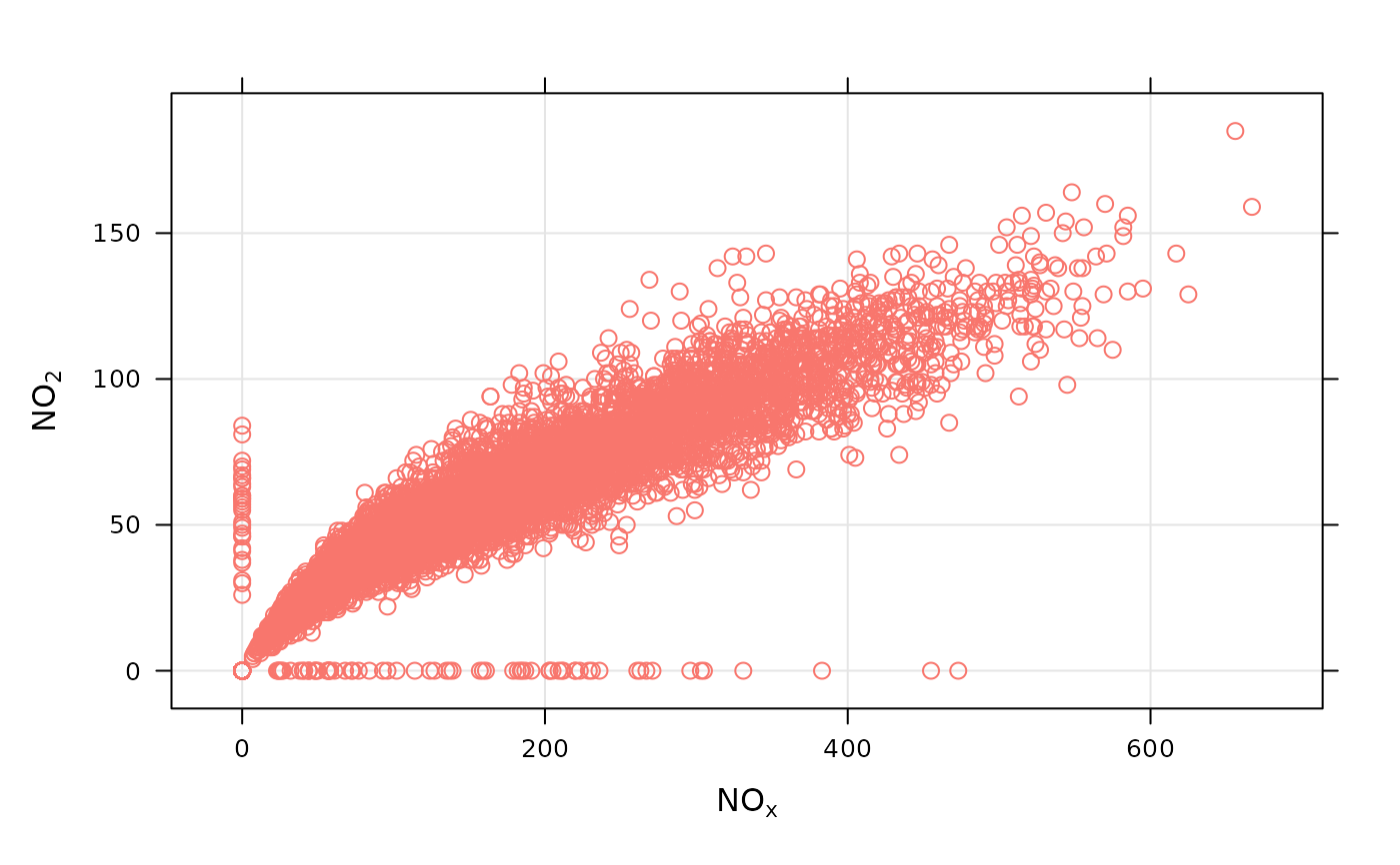
scatterPlot(dat2004, x = "nox", y = "no2")

if (FALSE) { # \dontrun{
# scatterPlot by year
scatterPlot(mydata, x = "nox", y = "no2", type = "year")
} # }

# scatterPlot by day of the week, removing key at bottom
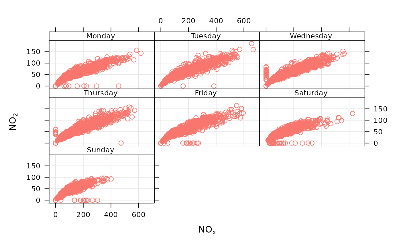
scatterPlot(dat2004, x = "nox", y = "no2", type = "weekday", key =
FALSE)


# example of the use of continuous where colour is used to show
# different levels of a third (numeric) variable
# plot daily averages and choose a filled plot symbol (pch = 16)
# select only 2004
if (FALSE) { # \dontrun{

scatterPlot(dat2004, x = "nox", y = "no2", z = "co", avg.time = "day", pch = 16)

# show linear fit, by year
scatterPlot(mydata, x = "nox", y = "no2", type = "year", smooth =
FALSE, linear = TRUE)

# do the same, but for daily means...
scatterPlot(mydata, x = "nox", y = "no2", type = "year", smooth =
FALSE, linear = TRUE, avg.time = "day")

# log scales
scatterPlot(mydata, x = "nox", y = "no2", type = "year", smooth =
FALSE, linear = TRUE, avg.time = "day", log.x = TRUE, log.y = TRUE)

# also works with the x-axis in date format (alternative to timePlot)
scatterPlot(mydata, x = "date", y = "no2", avg.time = "month",
key = FALSE)

## multiple types and grouping variable and continuous colour scale
scatterPlot(mydata, x = "nox", y = "no2", z = "o3", type = c("season", "weekend"))

# use hexagonal binning

library(hexbin)
# basic use, single pollutant
scatterPlot(mydata, x = "nox", y = "no2", method = "hexbin")

# scatterPlot by year
scatterPlot(mydata, x = "nox", y = "no2", type = "year", method =
"hexbin")


## bin data and plot it - can see how for high NO2, O3 is also high

scatterPlot(mydata, x = "nox", y = "no2", z = "o3", method = "level", dist = 0.02)


## fit surface for clearer view of relationship - clear effect of
## increased O3

scatterPlot(mydata, x = "nox", y = "no2", z = "o3", method = "level",
x.inc = 10, y.inc = 2, smooth = TRUE)
} # }
