AQ <- read.csv("G:/My Drive/York_teaching/air_quality.csv")Experimental design and exploratory data analysis
Techniques for postgraduates
Professor David Carslaw
Department of Chemistry, University of York
3rd March 2023
Topics for today
Exploratory data analysis
Introduction to reproducible research
Much less emphasis on common statistical tests e.g. hypothesis testing … more emphasis on approaches to working with and analysing experimental data
Will cover some useful concepts and principles over the next hour
Encourage some discussion
Session in a couple of weeks will be a chance to have a go yourself
Exploratory data analysis
Exploratory data analysis
“Far better an approximate answer to the right question, which is often vague, than an exact answer to the wrong question, which can always be made precise.” — John Tukey
Exploratory data analysis (EDA) is an important approach that has developed over many years
It is important to undertake when trying to understand almost any data
The broad goal is understanding your data and its characteristics
No set rules as such, but there are common types of analysis that are undertaken
Some aims of EDA
Get a ‘feel’ for your data. At this stage it is useful to check whether the data look to be reasonable based on experience and a theoretical understanding
EDA is useful to help generate questions about data.
These questions can be addressed by visualising, transforming, and modelling data.
Often, EDA will help to refine questions and/or generate new questions…
To some extent, a move away from hypothesis testing to considering the data to help develop hypotheses
Tools for EDA
Over the past 20 years R has become the leading software for conducting statistical analysis — or more generally data analysis.1
In our examples class next week we will use R and an Integrated Development Environment (aka a nice ‘front-end’!) called RStudio. The examples given here are based on using R and RStudio.
Some of the advantages of this approach include:
R is fantastically capable software and goes far beyond ‘just’ statistics;
very good for data exploration and data visualisation;
great for making your work reproducible and sharing it (we’ll come back to that);
these skills are highly valuable in academia, industry and almost any discipline that involves data.
Questions about your data
There are no rules about how EDA should be approached. However, a good place to start is understanding two broad issues:
What type of variation occurs within variables?
What type of covariation occurs between variables?
To answer these questions there are a large number of approaches that can be used that cover:
Numerical-type statistics (understanding numbers of measurements, their ranges, means etc.)
There are also a wide number of very useful ways to plot data to explore these characteristics
No silver bullet and having different ‘views’ / perspectives on data is very useful
Some example data to explore
We will use some air pollution data as a way of exploring some of the techniques for EDA. In the practical session use can be made of this data set … or maybe you have your own?
Look at first few lines of the data:
head(AQ) date ws wd nox no2 o3 pm10 so2 co pm25 month year
1 1998-01-01 00:00:00 0.60 280 285 39 1 29 4.7225 3.3725 NA Jan 1998
2 1998-01-01 01:00:00 2.16 230 NA NA NA 37 NA NA NA Jan 1998
3 1998-01-01 02:00:00 2.76 190 NA NA 3 34 6.8300 9.6025 NA Jan 1998
4 1998-01-01 03:00:00 2.16 170 493 52 3 35 7.6625 10.2175 NA Jan 1998
5 1998-01-01 04:00:00 2.40 180 468 78 2 34 8.0700 8.9125 NA Jan 1998
6 1998-01-01 05:00:00 3.00 190 264 42 0 16 5.5050 3.0525 NA Jan 1998Some example data to explore
Using the R function summary is very useful in a wide range of circumstances:
summary(AQ) date ws wd nox
Min. :1998-01-01 00:00:00 Min. : 0.000 Min. : 0 Min. : 0.0
1st Qu.:1999-11-14 15:00:00 1st Qu.: 2.600 1st Qu.:140 1st Qu.: 82.0
Median :2001-09-27 06:00:00 Median : 4.100 Median :210 Median : 153.0
Mean :2001-09-27 06:00:00 Mean : 4.489 Mean :200 Mean : 178.8
3rd Qu.:2003-08-10 21:00:00 3rd Qu.: 5.760 3rd Qu.:270 3rd Qu.: 249.0
Max. :2005-06-23 12:00:00 Max. :20.160 Max. :360 Max. :1144.0
NA's :632 NA's :219 NA's :2423
no2 o3 pm10 so2
Min. : 0.00 Min. : 0.000 Min. : 1.00 Min. : 0.000
1st Qu.: 33.00 1st Qu.: 2.000 1st Qu.: 22.00 1st Qu.: 2.175
Median : 46.00 Median : 4.000 Median : 31.00 Median : 4.000
Mean : 49.13 Mean : 7.122 Mean : 34.38 Mean : 4.795
3rd Qu.: 61.00 3rd Qu.:10.000 3rd Qu.: 44.00 3rd Qu.: 6.500
Max. :206.00 Max. :70.000 Max. :801.00 Max. :63.205
NA's :2438 NA's :2589 NA's :2162 NA's :10450
co pm25 month year
Min. : 0.000 Min. : 0.0 Jan : 5952 Length:65533
1st Qu.: 0.635 1st Qu.: 13.0 Mar : 5952 Class :character
Median : 1.140 Median : 20.0 May : 5952 Mode :character
Mean : 1.464 Mean : 21.7 Apr : 5760
3rd Qu.: 1.980 3rd Qu.: 28.0 Jun : 5581
Max. :19.705 Max. :398.0 Feb : 5424
NA's :1936 NA's :8775 (Other):30912 Using graphs in EDA
Graph plotting is an essential component of EDA. They are useful for:
Understanding data properties
Find patterns in the data
Suggest ways in which data can be modelled
It is generally useful to adopt a ‘quick and dirty’ approach at this stage, so
Plots that can be made quickly — something that R is great for …
Make lots of plots! Finesse later.
Develop a good personal understanding of the data
Useful to be guided by some questions you might want to ask of the data; even if vague
Histograms
Histograms are very useful for exploring the distribution of variables. The way to plot them in Base R is shown below.
hist(AQ$ws)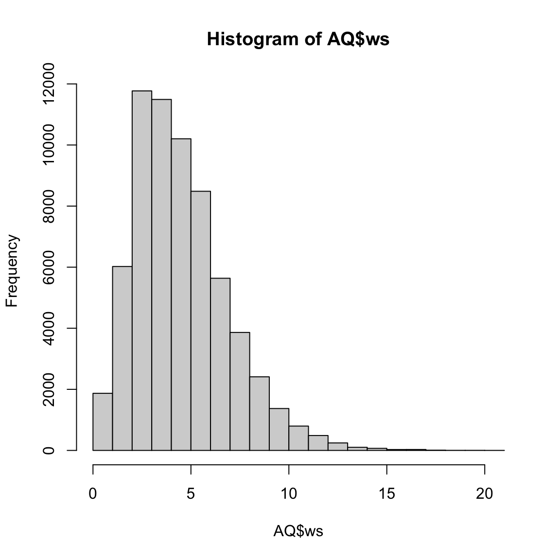
Histograms — alternative way of plotting
We can use the excellent plotting package ggplot2.1
library(ggplot2) # load the package
ggplot(data = AQ, aes(ws)) +
  geom_histogram()
Box and whisker plots
Box and whisker plots both a common and valuable way of considering the distribution of variables. Monthly distribution of NO2 (nitrogen dioxide):
ggplot(data = AQ, aes(x = month, y = no2)) +
  geom_boxplot()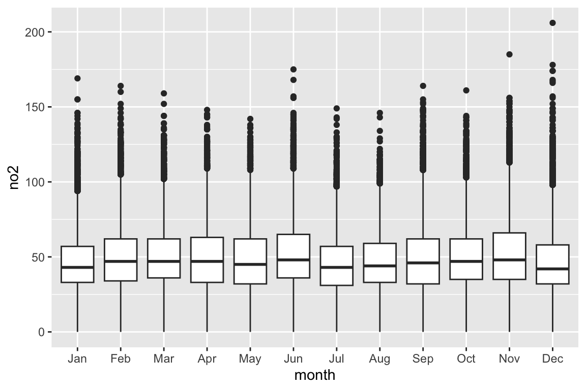
A box that stretches from the 25th percentile of the distribution to the 75th percentile (the interquartile range (IQR). In horizontal line displays the median value.
The points show individual observations that fall more than 1.5 times the IQR from either edge of the box. These points are unusual so are plotted individually.
A line (or whisker) that extends from each end of the box and goes to the farthest non-outlier point in the distribution.
Box and whisker plots
Box and whisker plots
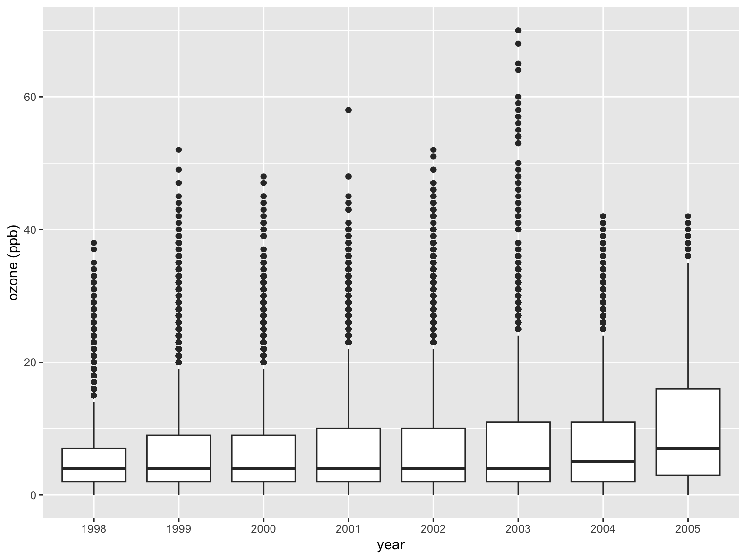
What can you say about this plot?
Scatter plots
Probably the most effective way of understanding how two numeric variables are related
I use scatter plots all the time — and the many varieties of them
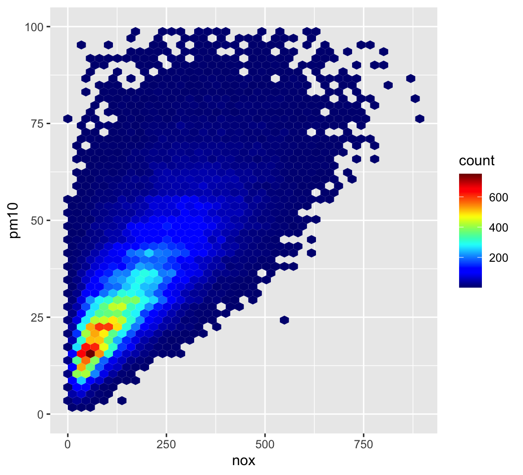
Plot in this case considers how NOx and PM10 are related
What conclusions or questions can be drawn from this plot?

Interactive scatter plots
Often very useful to explore actual values when plotting data.
Jan2003 <- subset(AQ, month == "Jan" & year == 2003)
ggplot(data = Jan2003, aes(x = nox, y = pm10)) +
  geom_point()
ggplotly()
Scatter plots when you have a lot of data
Can bin data and plot number of measurements in each bin
In this case hexagonal binning has been used
Highly effective when there is a lot of data
Scatter plot matrices
pairs(AQ[1:1000, 2:8])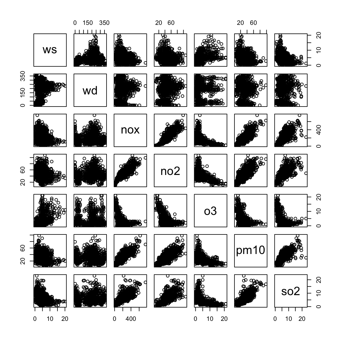
Introduction to reproducible research
What is reproducible research?
Being able to reproduce scientific experiments and verifying their outcomes is a basic tenet of science.
For simplicity we can think of two main applications:
-
For ‘real’ experiments this could mean that someone not involved with the experiment being able to follow all the steps necessary to reproduce the outcomes
following a clear method
confirming the same outcomes
For data analysis results are replicable if independent researchers can recreate findings by following the procedures originally used to gather the data and run the computer code.
For this course focused on data, a good working definition is:
The data and code used to make a finding are available and they are sufficient for an independent researcher to recreate the finding
Importance of reproducible research
So why bother thinking about and adopting reproducible research practices? There are many reasons:
-
From an individual perspective, being able to recreate one’s own work is important
- …and very frustrating if you can’t! It’s too easy to revisit previous work and not be able to replicate it — we have all been there!
Collaboration: it is increasingly important to be able to collaborate with others
Reproducible research is more likely to be useful for other researchers than non-reproducible research — more research impact
It’s becoming more prominent e.g. journals requesting the data and code to reproduce findings … most important for most important work
In general, these approaches lead to improved quality of work whether for research or industry, or anywhere else
Practical aspects when analysing data
All that sounds very worthy, but what does it mean in practice?
Use the source, Luke!
For data analysis, use ‘serious’ tools like R and Python and not Excel. Serious tools use scripts (i.e. source code) to carry out analyses. Why are scripts so useful? Here are some of the reasons:
Scripts are written in plain text and are human readable1
They encourage a separation between the data and the processing and analysis of the data — they help avoid the temptation to manually adjust the data directly as is common in Excel
They can be easily shared — email a small text file!
They can be brought under version control using a system such as git and code hosting and sharing sites such as GitHub
Producing documents
A very common way to work is to carry out analysis in software e.g. Excel, make some plots and paste them into Word. This approach is prone to error and inefficient. For example, it is requires some manual effort to copy and paste and if the data is revised, you need to do it all over again.
Is there a better way?
Recently, it is more common to use methods that mix analysis e.g. in R or Python with ordinary report writing in a single document
The approach is often referred to as dynamic documents
The document (a plain text file!) has ordinary report text and code ‘chunks’ that carry out the analysis such as making a plot
The document is compiled and all the code chucks are automatically run
The output can be a pdf, html or even a Word document
This presentation was produced in exactly this way using R!
Producing documents — R and python
Both R and Python are fantastic for producing reproducible note books (a modern-day lab book), as well as a wide range of other outputs including journal publications, web pages / sites and presentations.
Using R:
- In R use is made of R markdown
- A very simple mark-up language
- Extremely versatile outputs including pdf (via LaTeX) and html (great for interactive graphics)
- Single R markdown files (.Rmd) in plain text of course!
Using Python:
- Uses Jupyter Notebook; formerly called IPython Notebook
- Similar idea to R markdown