This function shows time series plots as stacked bar charts. The different
categories in the bar chart are made up from a character or factor variable
in a data frame. The function is primarily developed to support the plotting
of cluster analysis output from polarCluster and
trajCluster that consider local and regional (back trajectory)
cluster analysis respectively. However, the function has more general use for
understanding time series data.
Usage
timeProp(
  mydata,
  pollutant = "nox",
  proportion = "cluster",
  avg.time = "day",
  type = "default",
  normalise = FALSE,
  cols = "Set1",
  date.breaks = 7,
  date.format = NULL,
  key.columns = 1,
  key.position = "right",
  key.title = proportion,
  auto.text = TRUE,
  plot = TRUE,
  ...
)
Arguments
- mydata
A data frame containing the fields
date,pollutantand a splitting variableproportion- pollutant
Name of the pollutant to plot contained in
mydata.- proportion
The splitting variable that makes up the bars in the bar chart e.g.
proportion = "cluster"if the output frompolarClusteris being analysed. Ifproportionis a numeric variable it is split into 4 quantiles (by default) bycutData. Ifproportionis a factor or character variable then the categories are used directly.- avg.time
This defines the time period to average to. Can be “sec”, “min”, “hour”, “day”, “DSTday”, “week”, “month”, “quarter” or “year”. For much increased flexibility a number can precede these options followed by a space. For example, a timeAverage of 2 months would be
period = "2 month".Note that
avg.timewhen used intimePropshould be greater than the time gap in the original data. For example,avg.time = "day"for hourly data is OK, butavg.time = "hour"for daily data is not.- type
typedetermines how the data are split i.e. conditioned, and then plotted. The default is will produce a single plot using the entire data. Type can be one of the built-in types as detailed incutDatae.g. "season", "year", "weekday" and so on. For example,type = "season"will produce four plots — one for each season.It is also possible to choose
typeas another variable in the data frame. If that variable is numeric, then the data will be split into four quantiles (if possible) and labelled accordingly. If type is an existing character or factor variable, then those categories/levels will be used directly. This offers great flexibility for understanding the variation of different variables and how they depend on one another.typemust be of length one.- normalise
If
normalise = TRUEthen each time interval is scaled to 100. This is helpful to show the relative (percentage) contribution of the proportions.- cols
Colours to be used for plotting. Options include “default”, “increment”, “heat”, “jet” and
RColorBrewercolours — see theopenairopenColoursfunction for more details. For user defined the user can supply a list of colour names recognised by R (typecolours()to see the full list). An example would becols = c("yellow", "green", "blue")- date.breaks
Number of major x-axis intervals to use. The function will try and choose a sensible number of dates/times as well as formatting the date/time appropriately to the range being considered. This does not always work as desired automatically. The user can therefore increase or decrease the number of intervals by adjusting the value of
date.breaksup or down.- date.format
This option controls the date format on the x-axis. While
timePlotgenerally sets the date format sensibly there can be some situations where the user wishes to have more control. For format types seestrptime. For example, to format the date like “Jan-2012” setdate.format = "%b-%Y".- key.columns
Number of columns to be used in the key. With many pollutants a single column can make to key too wide. The user can thus choose to use several columns by setting
columnsto be less than the number of pollutants.- key.position
Location where the scale key is to plotted. Allowed arguments currently include “top”, “right”, “bottom” and “left”.
- key.title
The title of the key.
- auto.text
Either
TRUE(default) orFALSE. IfTRUEtitles and axis labels etc. will automatically try and format pollutant names and units properly e.g. by subscripting the `2' in NO2.- plot
Should a plot be produced?
FALSEcan be useful when analysing data to extract plot components and plotting them in other ways.- ...
Other graphical parameters passed onto
timePropandcutData. For example,timeProppasses the optionhemisphere = "southern"on tocutDatato provide southern (rather than default northern) hemisphere handling oftype = "season". Similarly, common axis and title labelling options (such asxlab,ylab,main) are passed toxyplotviaquickTextto handle routine formatting.
Value
an openair object
Details
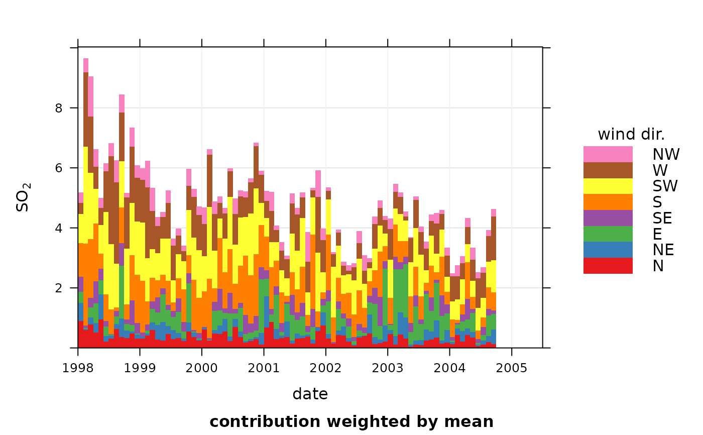
In order to plot time series in this way, some sort of time aggregation is
needed, which is controlled by the option avg.time.
The plot shows the value of pollutant on the y-axis (averaged
according to avg.time). The time intervals are made up of bars split
according to proportion. The bars therefore show how the total value
of pollutant is made up for any time interval.
See also
Other time series and trend functions:
TheilSen(),
calendarPlot(),
runRegression(),
smoothTrend(),
timePlot(),
timeVariation(),
trendLevel()
Other cluster analysis functions:
polarCluster(),
trajCluster()